In 2013, the Miami Dolphins underwent a major branding overhaul, debuting a new primary logo and uniform set. This change not only brought with it an all-new and very sleek Dolphin, but a modified color scheme as well with lighter shades of their longstanding colors all around. Just a few years after I got the old one tattooed…
Logo: 1997-2012 || 2013 – 2017
The NFL has a rule around branding, particularly uniforms, in that they can only be updated once every five years. Not only does this help boost sales of new jerseys, hats, etc when the refresh happens but it also helps to protect the brand – impatience with your branding can create confusion for the consumer. That would be bad for business.
So, with that rule in mind, any changes that Miami may have wanted to make had to wait until 2018 at the earliest – even if the changes were subtle.
Logo: 2013-2017 || 2018 – Present
Fast forwarding to 2018, the Miami Dolphins found themselves again eligible to update their uniforms and branding – and did. This time, the changes were small but mighty with a very clear focus on amplifying the brand not only to in-stadium audiences but at-home fans as well.
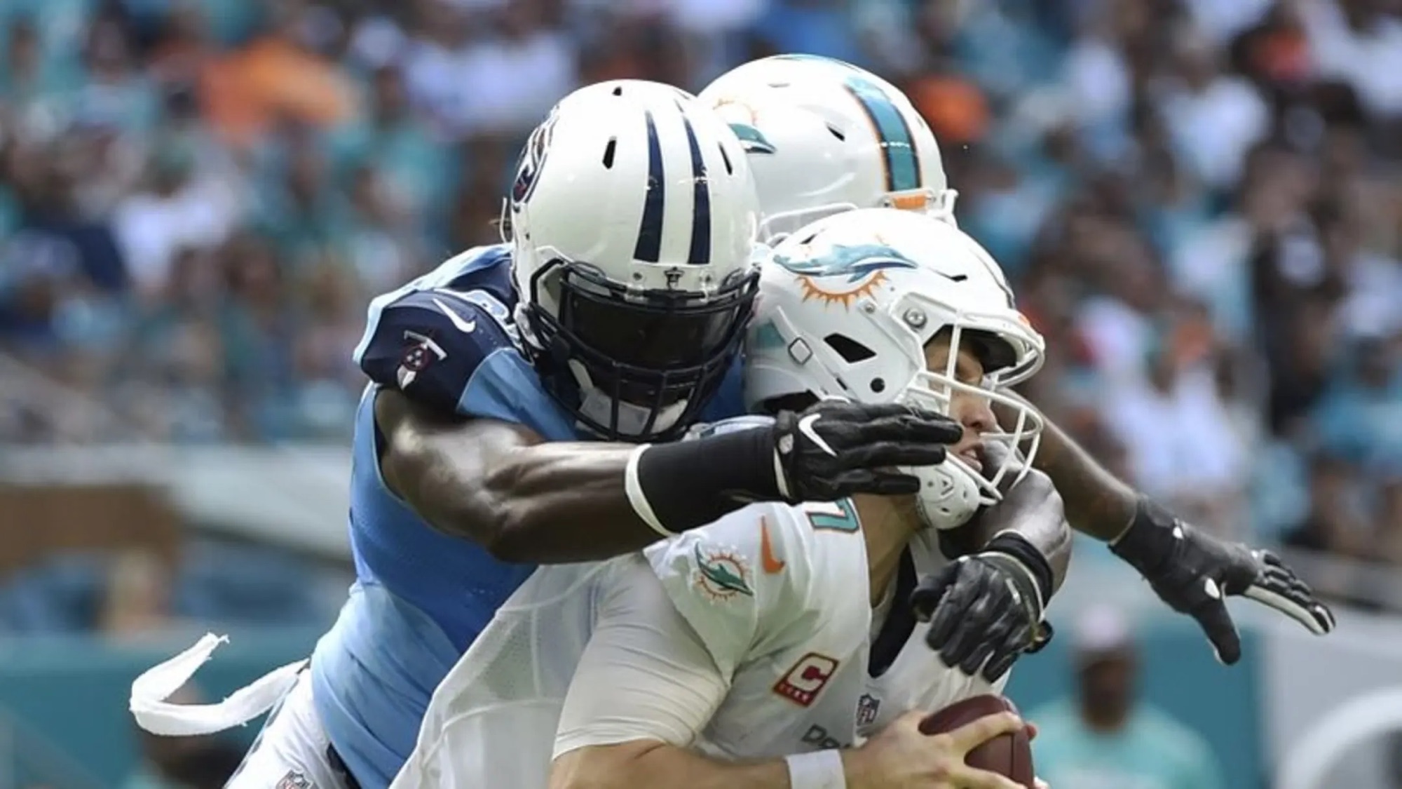
What changed? It really came down to colors. Not only did they deepen the orange in the logo but they also emphasized it on the uniform and helmet. Let’s dig in.
Helmet: 2013-2017 || 2018 – Present
First, you can see right away that the darker orange really pops against the white helmet. It’s especially nice that orange is now set adjacent to the brilliant Dolphins aqua (don’t you dare say teal) rather than against the blue color that was removed entirely.
Another small note – the MIAMI above the forehead is now easier to read with the darker orange text.
Uniform: 2018 – Present
As was the case with the helmet update, gone is the darker blue from the previous uniform sets, making way for a richer and thicker orange outline around the numbers. As a fan that watches the Dolphins primarily on television from the comfort of my own living room – these definitely pop on the broadcast which I have to imagine was part of the plan.
I can’t stress enough how much that small change really stood out to me, making these uniforms easily one of the nicest non-throwbacks in the National Football League.
So what’s the big deal?
That brings me to why I think this uniform update – while small on the surface – was significant.
First, I believe the Miami Dolphins when they say they wanted to pay homage to uniforms from the past. I mean, why wouldn’t they? I also think they did a good job in doing just that.

I can also see first-hand the impact that having sharper, thicker, and richer orange lines around the name plates and numbers can have on watching the game from home. The numbers really do pop on the screen making legibility even better for fans. It also doesn’t hurt that the aqua and orange are no longer competing with the blue, creating a really nice contrast.
Now, if you’ve gotten this far I know it’s largely because you are holding out hope that I’ll say that I believe that 2018 was the year to make our throwbacks permanent. If I’m being honest, I don’t disagree with you. They really are easily the nicest uniforms in the NFL. Hard stop.
Having said that, if there had to be an update that didn’t include making the throwbacks permanent I’m really glad this was it. I stand by the point I made before – that our current uniforms are up there as some of the nicest non-throwbacks in the game.
Now, that five year rule runs through the 2022 season which means that 2023 is the first year the Miami Dolphins will be eligible to make another change. But will they?